
Interior design
Which painting for a bedroom: calming colours, subjects that help you sleep, placement facing the bed
Published on ·4 min read
The bedroom is the only room where you look at a painting lying down, in half-light, at the end of the day. It is not a work you admire, it is an image you carry into sleep. So it asks for something other than a living-room painting: less contrast, more warmth, a subject that soothes.
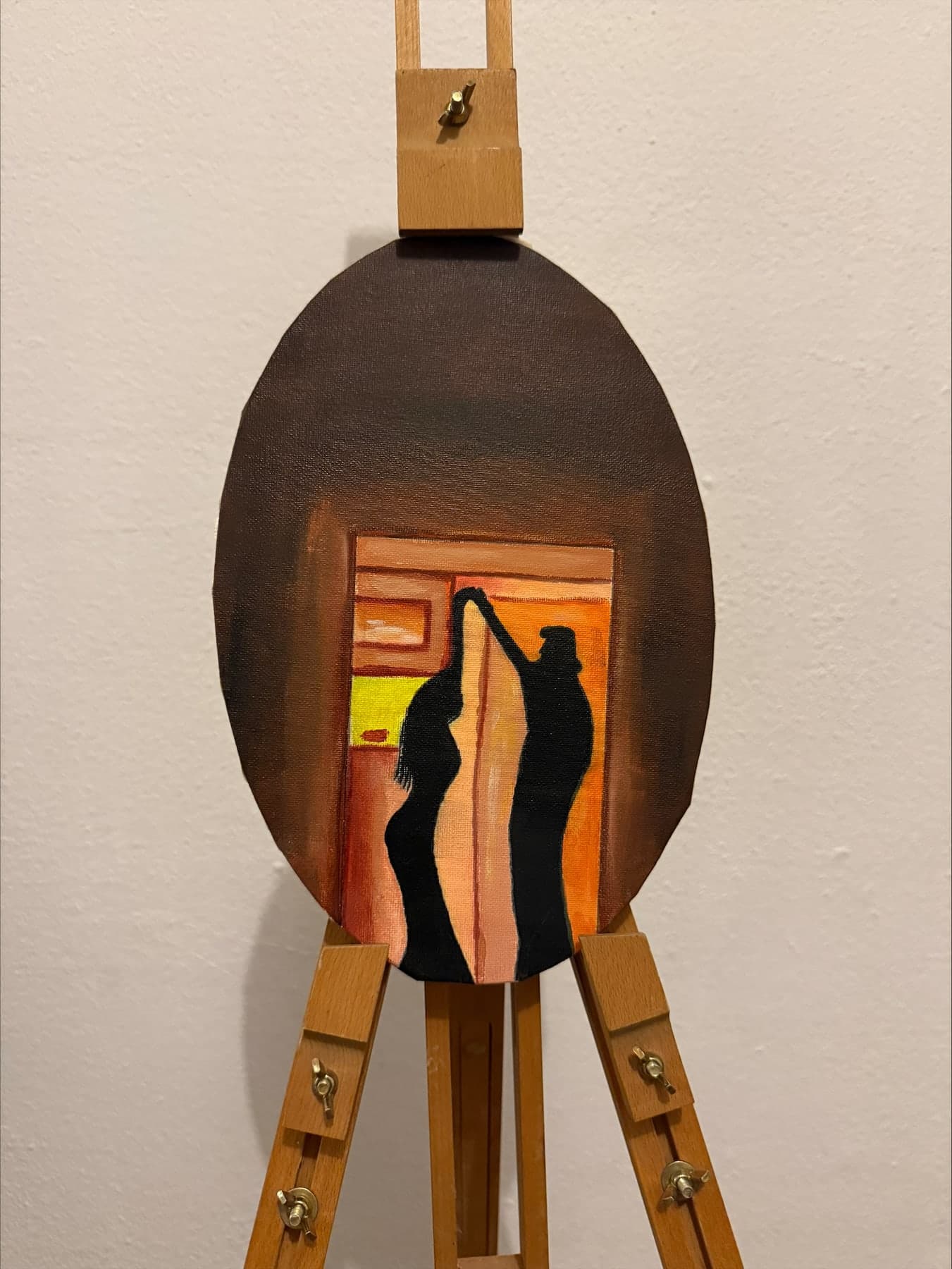
This guide gives the colour, subject, format and placement rules specific to the bedroom, with the IS × SEY Maison canvases as examples, including Warm 50s, painted in the ochres of a 1950s living room.
Colours: warm, dark, no bright white
The body falls asleep when its temperature drops and the light turns warm. A canvas in warm, dark colours, ochres, browns, oranges, deep reds, goes along with that: it absorbs light rather than reflecting it, and resembles the glow of a bedside lamp. That is the register of Warm 50s, two silhouettes in a doorway, on a brown ground that fades towards the edges.
Conversely, bright whites, cool blues, large saturated fields of green or lemon yellow reflect light and wake you. They belong in a kitchen or an office, not facing a bed. A bedroom painting is judged at 10 pm under dimmed light, not at noon in full daylight.
The subject: a calm scene you can look at a hundred times
A bedroom painting is seen every night for years. It must bear repetition. The subjects that bear it best are calm scenes: an interior, two people, a silhouette, a landscape with no sharp horizon. They let the eye settle without holding it. Highly contrasted abstracts, busy scenes, faces looking at the viewer end up agitating, especially in half-light where the eye interprets.
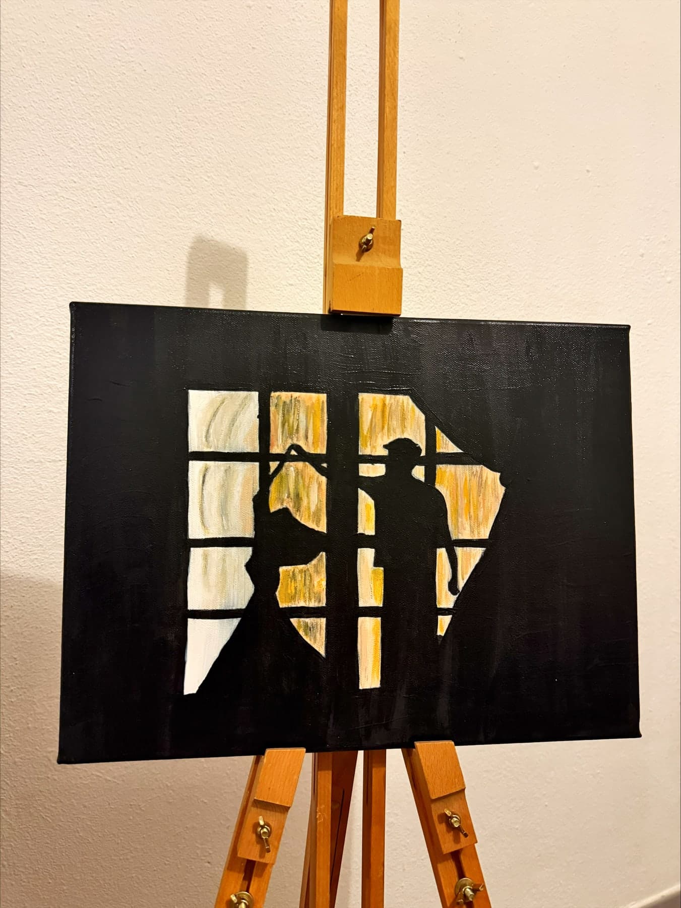
Warm 50s holds that place: a scene between two people, in shadow, in end-of-evening light, that the oval of the canvas closes like a keyhole. You return to it every night without the scene wearing out. Glass of wine, with its bright red on green, works in a dining room; in a bedroom you would have to dim it very low.
- ·Soothing subjects: interior, silhouettes, two-figure scene, soft landscape
- ·Subjects to avoid facing the bed: frontal faces, motion scenes, saturated abstracts
- ·Format: 30 to 50 cm a side, never a large format that crushes the room
One-of-a-kind canvases, painted for the house.

Placement: facing the bed, never above it, centre at 130 cm
The wall facing the bed is the one you look at lying down: that is where the bedroom painting goes. Above the headboard you never see it, and risk knocking it when getting up. On a side wall you see it askew. Facing the bed, the centre of the canvas drops to 130 cm from the floor, lower than a hallway's 145 cm, because the gaze starts at pillow level.
A chest of drawers or desk under the wall facing the bed does not change the rule: the frame bottom stays 15 to 25 cm above the furniture, and if that pushes the centre above 140 cm, better to rest the canvas on the furniture, leaning against the wall. It is even the gentlest solution for a bedroom: nothing fixed, the work moves in a second.
Evening light: the ceiling light does half the job
A bedroom painting lives under evening light. A cool-white ceiling light flattens it and wakes you; warm white at 2700 K dimmed to 20 or 30 % makes it appear as by candlelight. An ochre canvas like Warm 50s then takes on its full depth: the browns sink, the door lights up, the bedroom closes in on itself.
The Boréal 107 is the bedroom ceiling light that makes this possible from the bedside table: dimmable warm white in the evening, neutral in the morning, and, when summer comes, air movement at 30 dB for sleep at a felt 24 °C. The canvas on the wall, the light on the ceiling: the whole bedroom prepares for sleep.
A bedroom painting is chosen warm and dark, calm, in small or medium format, facing the bed with the centre at 130 cm, or simply resting on the chest of drawers. Lit in dimmed warm white, it becomes the last image of the day. Warm 50s, a 40 × 30 cm oval in ochres, was painted for that wall, and the Boréal 107 for the light that goes with it.
Frequently asked questions
What painting colours for a bedroom?+
Warm, dark colours: ochres, browns, oranges, deep reds, which absorb light and go along with the body's temperature drop before sleep. Avoid bright whites, cool blues and saturated fields, which wake you.
Where to hang a painting in a bedroom?+
On the wall facing the bed, the one you look at lying down, with the centre of the canvas 130 cm from the floor. Never above the headboard, where you cannot see it. A canvas resting on the chest of drawers, leaning against the wall, is also a good solution.
What size painting for a bedroom?+
A small or medium format, 30 to 50 cm a side, facing a 140 to 160 cm bed. A large format crushes a bedroom and holds the gaze instead of letting it settle. An oval or landscape format softens the reading further.
The SEY Maison Circle
Every month, an exceptional piece. Never reissued.
The Drops principle: one high-end furniture piece per month, in a numbered edition. Once it's gone, it never comes back. Circle members are notified 48 h early, access each drop 24 h before everyone else, and receive our guides before publication.
Discover the Drops →Also worth reading
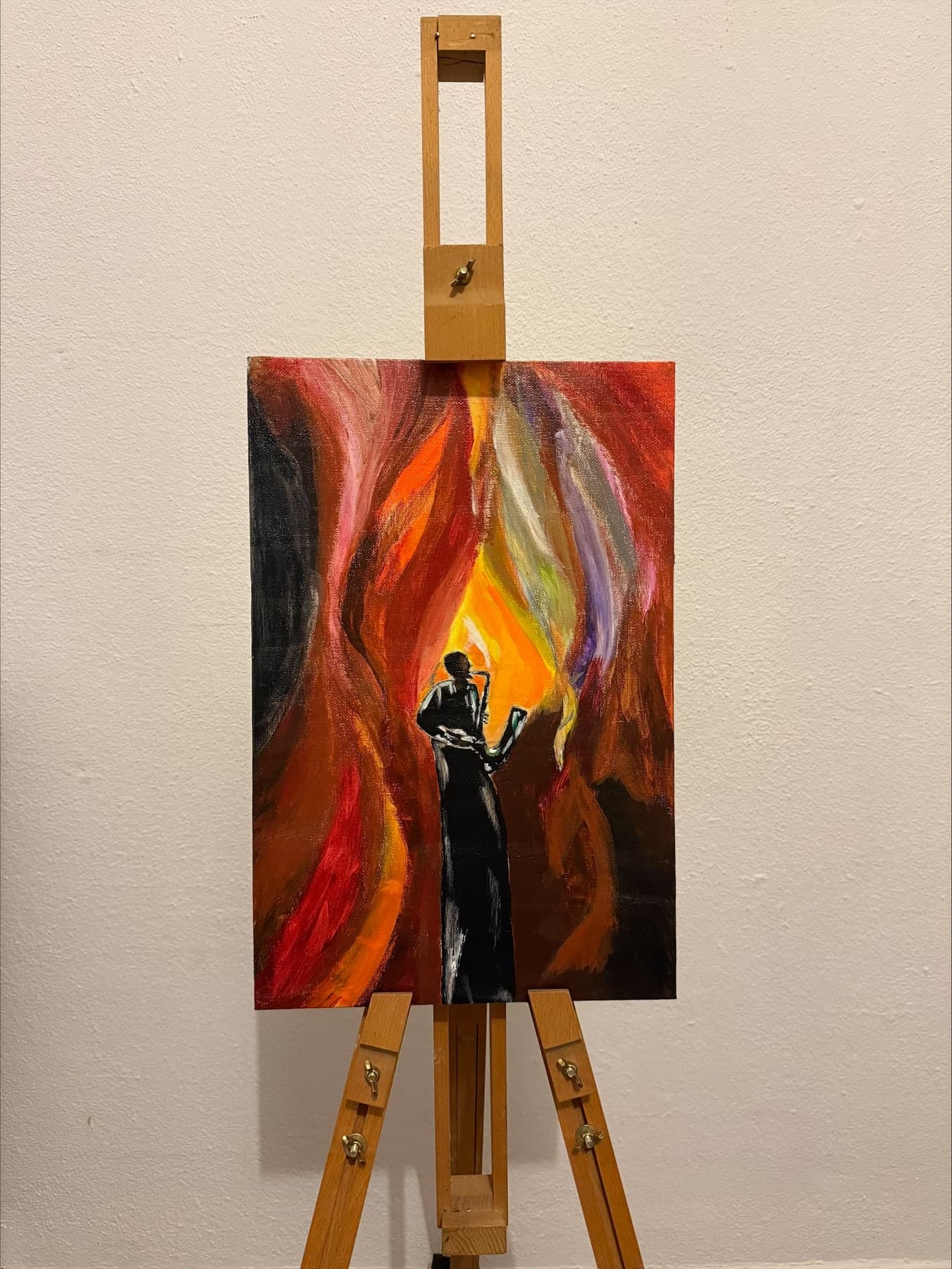
Lighting a painting at home: colour temperature, angle and intensity that respect the canvas
Read the article →
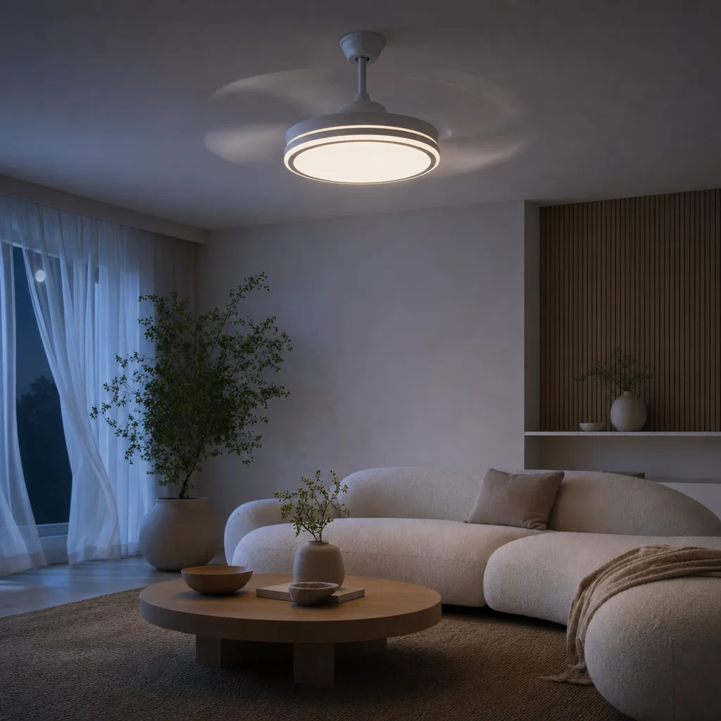
Ceiling fan and television: avoiding LED glare on the screen and blade flicker
Read the article →

Gallery wall or a single canvas: which to choose for your living room, and why empty space matters
Read the article →