
Interior design
Luxury interior colours: cream, ink and brass palettes for a premium space
Published on ·4 min read
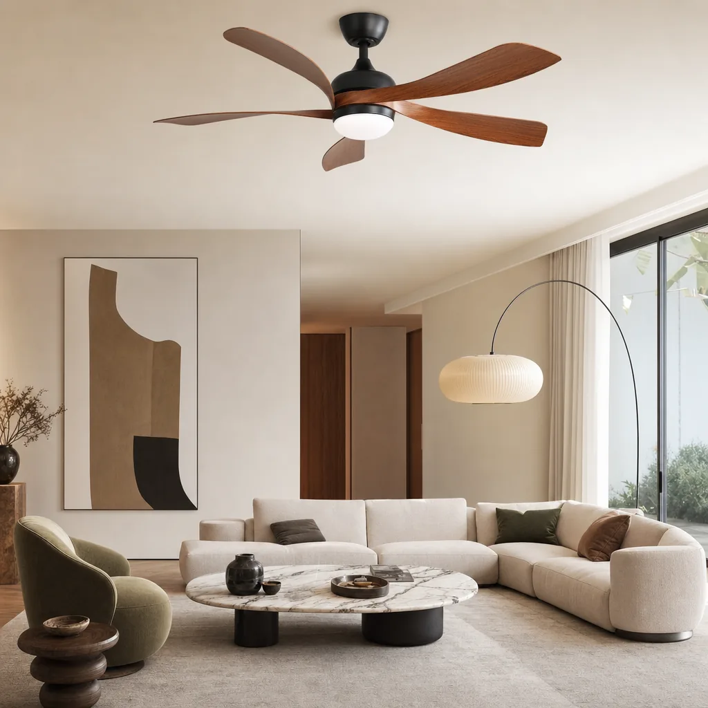
The most elegant interiors you have ever seen share one thing: a restricted palette. Not a poor one, a restricted one. Two or three colours chosen with almost surgical precision, played across different materials and intensities. Chromatic luxury is not profusion: it is mastery.
This guide explores the most effective palettes in contemporary premium interiors, cream and its variations, ink and deep blue, brass and copper accents, with the psychology behind them and the ratios that guarantee their effectiveness.
The cream palette: active neutrality, never boring
Cream is not white. White is maximal, reflecting everything, simultaneously hospitable and aggressive. Cream, ivory, warm milk, natural linen, greige, absorbs light slightly and creates an atmospheric warmth that white cannot achieve. In a premium interior, cream is the ultimate base: it enhances every other material, works in all lights, and ages infinitely better than pure white.
The subtlety of cream lies in its undertones. A yellow cream (ivory) warms a north-facing room; a pink cream (old white) softens it; a grey cream (linen greige) sophisticates it. These nuances only reveal themselves in natural light.
- ·Warm ivory: for north-facing rooms or those lacking natural light
- ·Linen greige: universal, sophisticated, the most versatile of the cream family
- ·Rosy off-white: for bedrooms and sitting rooms with a soft atmosphere
Ink, midnight blue, deep green: controlled audacity
Deep colours, ink blue, bottle green, charcoal, plum, are the most misunderstood luxury colours. They are thought reserved for large surfaces or bright rooms. In reality, they often work best in small spaces: a study or corridor painted midnight blue is not oppressive, it is enveloping, like a cabinet of curiosities.
The rule for deep colours: never use them bare. They need light materials (white linen, cream travertine, pale wood) and multiple light sources. A bottle-green wall with a cream velvet sofa, brushed brass ceiling fixture and pale oak floor is one of the most elegant arrangements possible.
The Vague 132
Five curved blades · Ø 132 cm · LED & remote
- ✓Five curved walnut-effect blades: the presence of a period fan
- ✓Silent DC motor, 6 reversible speeds
- ✓Integrated dimmable LED + remote control
€259€329
Brass, copper, pale gold: precious chromatic accents
Brass is not a colour, it is a material. But in an interior palette it behaves like a 10% accent that warms the whole and adds depth. A cream-and-wood interior without a metallic accent is pleasant; with brushed brass on light fixtures, handles and accessories, it becomes luxurious.
The rule on metal mixing: choose one primary metal and stay with it. Mixing brass, chrome, stainless steel and nickel in the same room creates chromatic cacophony. Brushed nickel is the only metal that combines naturally with brass, they share a similar warmth.
Applying the ratios: from large to small
A luxurious interior is built from large to small. First the architectural surfaces (floor, walls, ceiling), dominant colour, 60 to 70%. Then large furniture (sofa, bed, table), secondary colour, 20 to 30%. Finally details (light fixtures, objects, cushions, handles), accent colour, 5 to 10%.
The most common mistake is inverting the ratios: white walls with an over-coloured sofa and objects everywhere makes a room without a palette. Another mistake is believing the accent must be from the same family as the dominant. It is precisely the tension between cream and brass that makes an interior memorable.
A luxury palette is simultaneously courageous and controlled. Cream with a layer of deep green, brass that punctuates without dominating, a few textural touches that carry the colour, this is the grammar of interiors that remain beautiful for decades. Our Vague fans, with their brushed brass body and walnut blades, are designed to function as a noble chromatic accent in any of these arrangements.
Frequently asked questions
Can a dark room look luxurious without being oppressive?+
Yes, on two conditions: multiply light sources (never a single overhead point) and compensate with reflective materials, mirrors, polished brass, glass. A cream-painted ceiling in a dark-walled room preserves perceived height.
How to choose between several cream shades?+
Test them in natural light at different times of day. Morning light is cool and reveals pink undertones. Late afternoon warm light exacerbates yellow undertones. Choose the shade that convinces you at both moments.
How many colours maximum in a coherent interior?+
Three colours per room, ideally from the same temperature family (all warm or all cool). Beyond that, the eye struggles to find hierarchy. Variations of the same colour (light cream, medium cream, dark greige) count as one colour.
The SEY Maison Circle
Every month, an exceptional piece. Never reissued.
The Drops principle: one high-end furniture piece per month, in a numbered edition. Once it's gone, it never comes back. Circle members are notified 48 h early, access each drop 24 h before everyone else, and receive our guides before publication.
Discover the Drops →Also worth reading
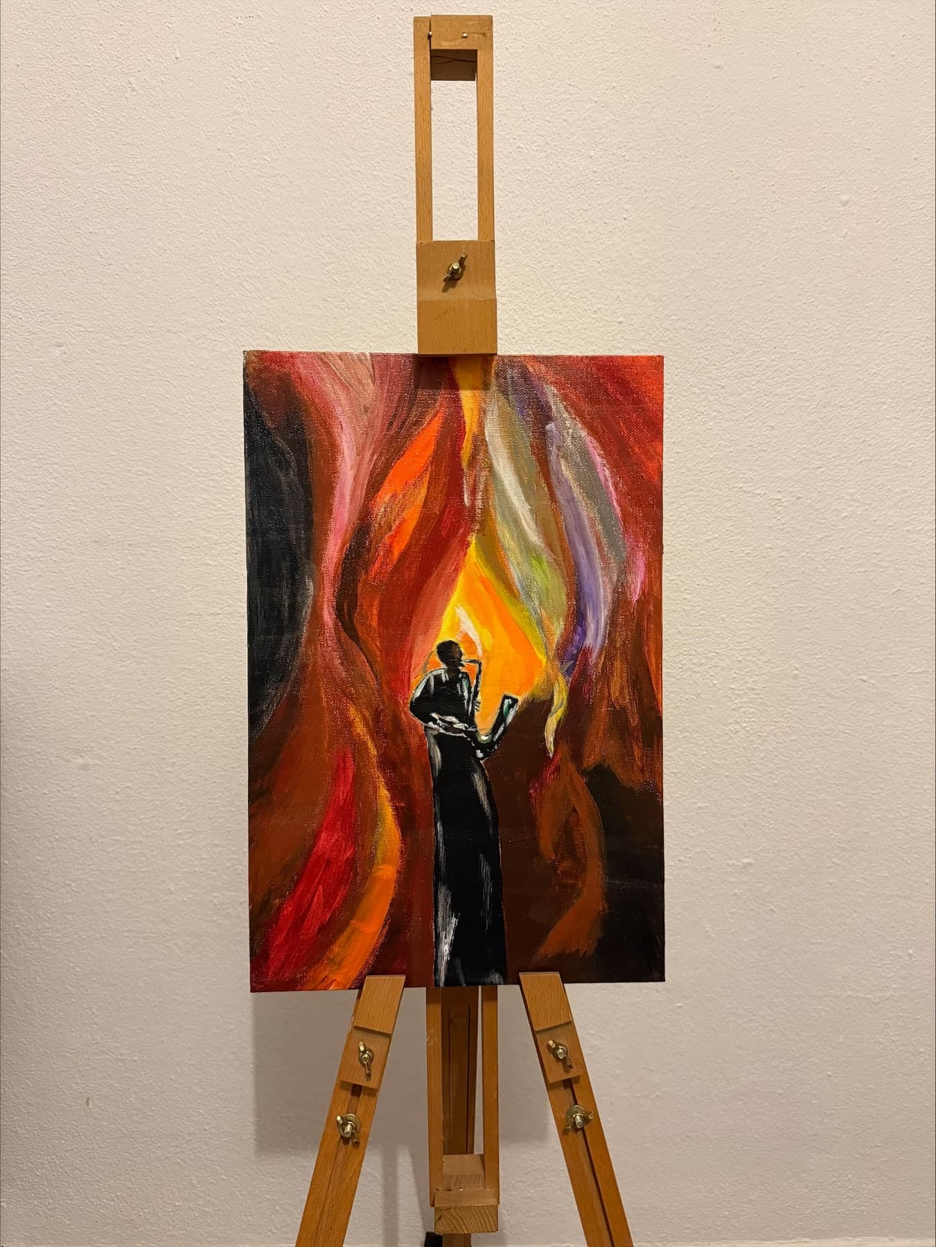
Lighting a painting at home: colour temperature, angle and intensity that respect the canvas
Read the article →
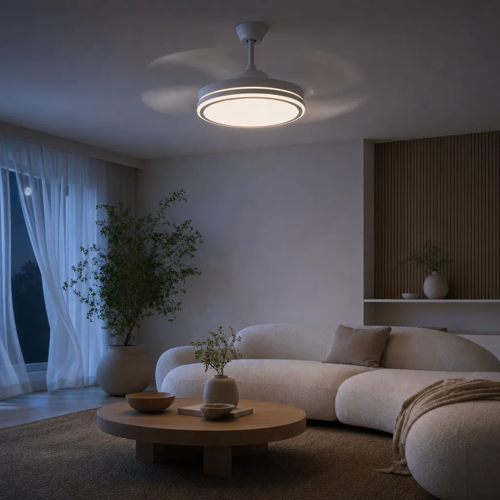
Ceiling fan and television: avoiding LED glare on the screen and blade flicker
Read the article →

Gallery wall or a single canvas: which to choose for your living room, and why empty space matters
Read the article →